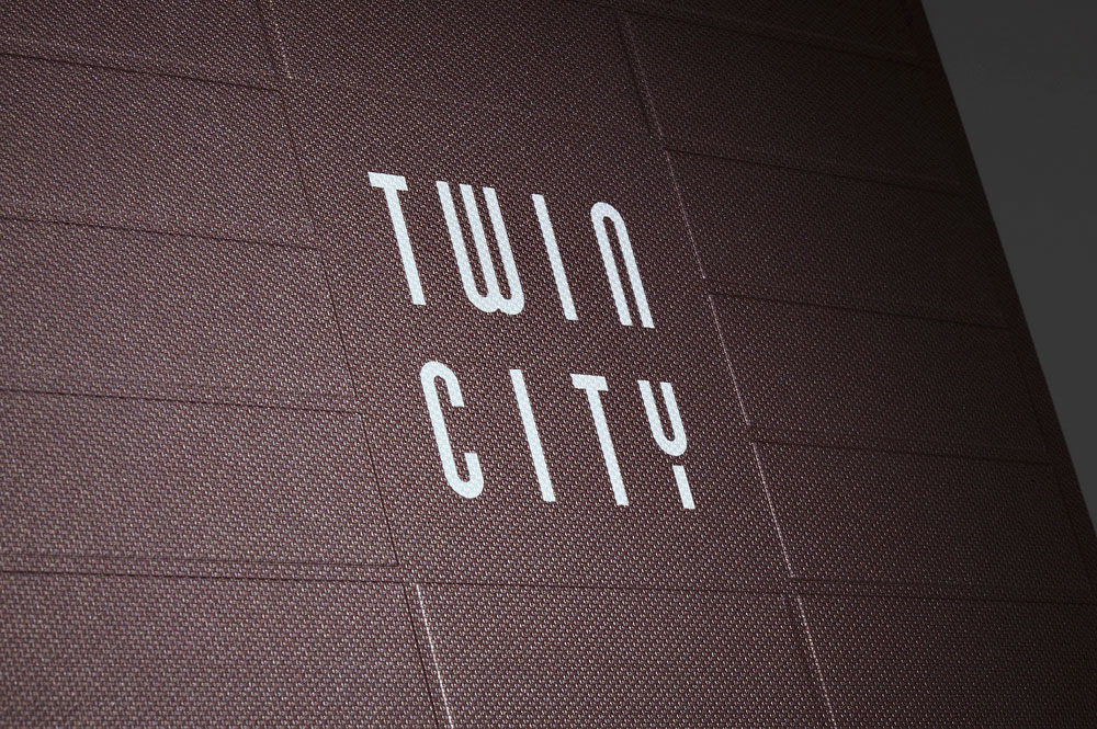
Twin City
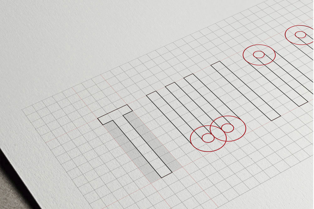
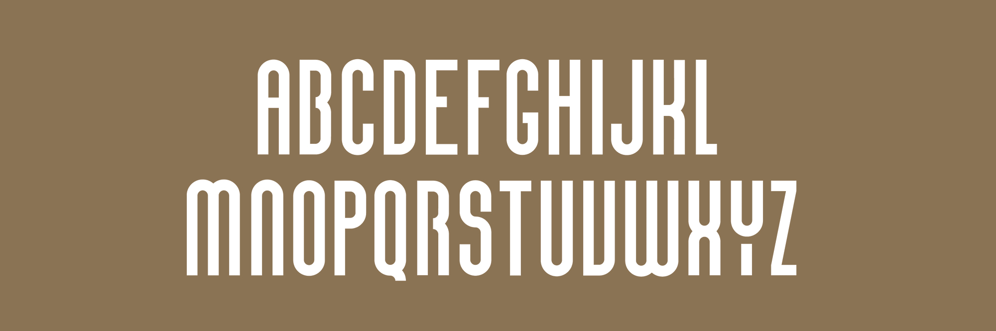
In many ways, Twin City was a groundbreaking project that positively changed a long-neglected district of Bratislava. When designing the logo, we used the pattern of the brick facade as our grid. Based on this grid, we designed Twin City's own modular font, which we then used to create a unique, minimalist and, above all, timeless logo. For the first stage of the project (buildings A B C) we also created a brochure and a website. In collaboration with the architects we designed wayfinding for Twin City Tower - from garage to the top floor.

Logo + Identity


Wayfinding


Graphic design


Photography